Showing posts with label Leeds Library Promo Brief. Show all posts
Leeds Library Promotional Campaign - Final Printed Products
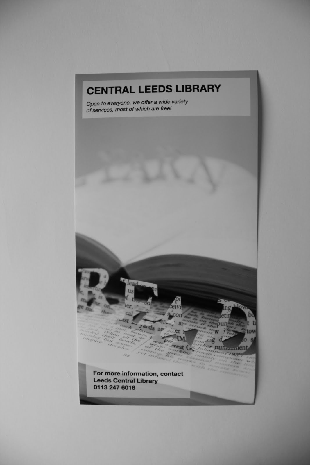
Below are photographs of the actual print outs of my finished designs. I just need to photograph/place these in context to get the full effect of the designs.


Labels:
FMP,
Leeds Library Promo Brief
Leeds Library Promotional Campaign - Layout Development
As mentioned earlier - My experimentation with layout and typography, using the same cut out text from books imagery but in black and white with some grey tones to add depth to the design. My initial ideas are at the top of this blog post and the final designs are at the bottom. In the end I change the heading typefaces to a more simple sans serif font, included a white opaque box behind the text (for ease of legibility) and made the image more of a focus in the design.


Labels:
FMP,
Leeds Library Promo Brief
Leeds Library Promotional Campaign - Changed Imagery
After designing new layouts with the cut letters in black & white, I decided to go back to the cut out text in the books, but have those photos in black & white. This will make the designs cheaper to print, while still keeping the sophisticated element and I also changed the address on the promotional designs to the phone number of the library as this is more of an appropriate call to action for the contexts, for example on a banner in Leeds city centre, it will be easier to take a phone number than write down an address for example. Once I have experimented with layouts and typography in association with the changed imagery I will upload photos.
Labels:
FMP,
Leeds Library Promo Brief
Leeds Library Promotional Campaign - Leaflet Layout Re-design
The first two images are of the leaflet that I redesigned with my chosen imagery, typography and layout, but using the Leeds Library body copy, and the second image is of what the other promotional imagery will look like, it will just have to be adjusted for specific sizes of contexts. I decided to use imagery from here for the imagery for the promotional campaign, but change it to black & white as I thought this would be cheaper and would also add a sense of sophistication.


I have used the same imagery from the leaflet for an A6 flyer design which will also be applied to a banner design for use around the city centre, a magazine advert in a local magazine and as a poster for inside the library.


I have used the same imagery from the leaflet for an A6 flyer design which will also be applied to a banner design for use around the city centre, a magazine advert in a local magazine and as a poster for inside the library.
Labels:
FMP,
Leeds Library Promo Brief
Leeds Library Promotional Campaign - Typographic Tagline
I decided to change the tag line from listen, read etc and just use these words as the cut out imagery, and replace this with the text "Open to everyone, we offer a wide variety of sources, most of which are free!" This is longer, but it works better on the posters, magazine ad, banner etc and with just the inclusion of a telephone number it gives the promotional material a call to action.
Labels:
FMP,
Leeds Library Promo Brief
Leeds Library Promotional Campaign - Imagery Change
After a crit it was mentioned that the photos of text popping out of the books looked slightly flimsy and not very strong, and it was suggested that I cut into books instead. Below you can see examples of this. I think this effect is too bold and will take away from the information to be placed on the posters.


The experimentation above led to the development below, and these images were created by using the letters cut out of the books placed on paper/board ad photographed. I think these have a slightly more subtle and abstract look, which work well as imagery for a poster as it will make the typography and information more relevant and noticeable.
Labels:
Development,
FMP,
Leeds Library Promo Brief
Leeds Library Promotional Campaign - Final Ideas For Council
Below you can see the final designs (not on the actual stock to be used) that I would present to the Library. After having another crit, it was mentioned that the colour choice for my designs was dull and unappealing (which I kept as it was the Libraries existing colours) So these designs would be as I would present to the Library and I will redesign them in my own style and taste.


Labels:
FMP,
Leeds Library Promo Brief
Leeds Library Promotional Campaign - Crit
After a crit I had, people mentioned they liked the imagery but felt the colours were old and really dated the work. This is not really something I can help as these are the colours of Leeds City Council, but Justin said I could create a version of the promotional work that is more my style. So I will make some changes to colours and fonts, which are more my style and I think this will create a more appealing contemporary aesthetic. It was also mentioned that I could try and cut into the books to give the imagery a bit more of a solid feel instead of the typography sticking out of the books. I will try this to see how it affects the imagery.
Labels:
Development,
FMP,
Leeds Library Promo Brief
Leeds Library Promotional Campaign - Leaflet/Flyer Development
The images below show my development of my designs for the Libraries promotional material. The images below include imagery and layouts for the leaflet the library currently use for information (of which I used the body copy for) an A6 flyer to be designed and a magazine advert that will be placed in the local magazine "The Leeds Guide" My initial images are at the bottom of this post and as you see images closer to the top of the post they are the more final designs.


Labels:
Development,
FMP,
Leeds Library Promo Brief
Subscribe to:
Posts (Atom)